Showing posts with label Tutorial Photoshop. Show all posts

Saturday, June 8, 2013

Gonta Ganti Warna Rambut Sesuka Hatimu

Tutorial kali ini kita akan mencoba editing pada warna rambut.. kita dapat mengganti warna rambut sesuai dengan suasana hati...ada yang perlu kamu ingat, tidak semua warna rambut bisa dirubah, biasanya warna hitam polos sulit untuk diwarna kecuali rambut tersebut memiliki higlight…

ini dia Langkah - langkahnya photoshop tutorial :
1. Buka File gambar diatas dengan Photoshop:
Kamu bisa donlot disini : http://wallpaperstock.net/alexis-bledel-wallpapers_w5529.html 2. Seleksi bagian rambut pada gambar menggunakan POLYGONAL LASSO TOOL

3. Klik pada Menu SELECT > FEATHER (isi Feather Radius : 10 px ) OK

4. Klik Menu IMAGE > ADJUSTMENTS > VARIATIONS
Kamu tinggal klik pada salah satu warna atau lebih untuk mendapatkan warna yang seseuai…klik ORIGINAL untuk mengembalikan pada warna asli gambar….


sumber

Monday, April 1, 2013

Tips Komposisi Fotografi: Belajar Melihat Secara Abstrak

Ilustrasi (Info Fotografi)
Jakarta - Salah satu keterampilan yang dibutuhkan untuk dapat membuat komposisi foto yang bagus adalah kemampuan melihat secara abstrak. Saat saya memotret pantai misalnya, yang saya lihat bukan hanya matahari, batu, air, tapi saya juga melihat bentuk, warna, garis dan hal-hal abstrak lainnya.

Kemampuan menyederhanakan pemandangan yang kompleks merupakan ketrampilan yang penting untuk fotografer yang ingin membuat komposisi foto yang lebih bagus.

Ada beberapa elemen yang penting yang harus selalu kita perhatikan sebelum memotret:

Form/bentuk: Bagaimana bentuk subjek foto? Apakah beraturan atau simetris? Apakah berbentuk segitiga, persegi atau lingkaran? Setiap orang menyukai bentuk tertentu dan setiap orang merespons bentuk secara berbeda. Jadi tidak ada bentuk yang terbaik. Yang penting adalah bagaimana kita menyusun (menempatkan) subjek foto di dalam frame foto.

Garis: Elemen garis mengarahkan mata kita menuju subjek utama. Garis yang lurus mencerminkan ketegasan dan kekuatan, garis lengkung sifatnya lebih lembut dan dinamis. Garis lengkung dapat digunakan untuk mempertahankan pemirsa dalam foto, misalnya foto subjek yang berbentuk spiral.

Gelap terang: Mata pemirsa biasanya melihat ke daerah yang terang terlebih dahulu, dilanjutkan dengan daerah yang gelap. Gunakan fakta ini untuk menuntun mata pemirsa untuk melihat subjek yang ingin ditonjolkan, dan yang mana yang ingin disembunyikan.

Warna: Warna yang hangat seperti merah, kuning, jingga dan yang saturasinya (kejenuhannya) tinggi akan menarik perhatian. Warna yang tidak terlalu pekat atau hitam putih akan meningkatkan perhatian ke bentuk, garis dan gelap terang.

Ada beberapa contoh yang membantu saya mengkomunikasikan apa yang saya lihat saat memotret foto-foto di bawah ini:


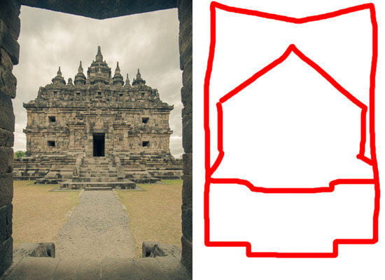
Bentuk segitiga pada Candi Plaosan ini menarik perhatian saya


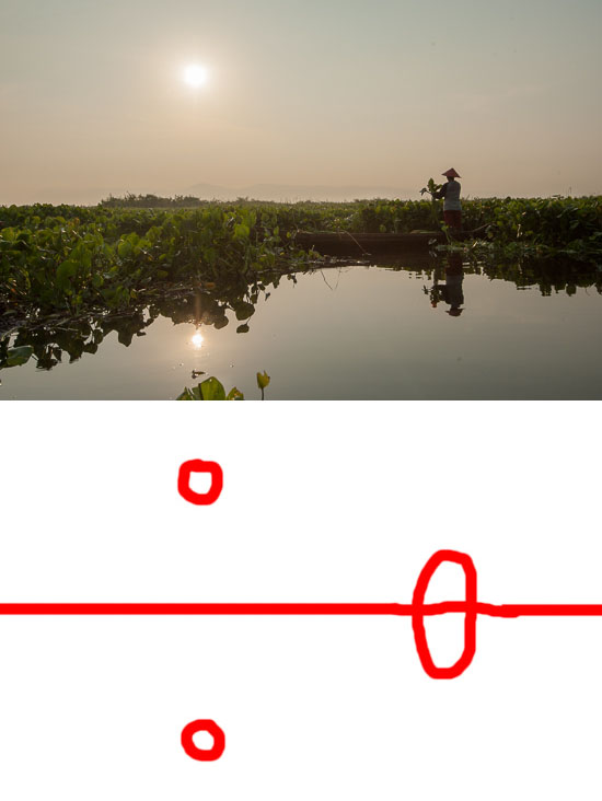
Matahari yang terang, dan bentuk tubuh manusia menarik perhatian mata.


Garis yang terbentuk dari jembatan ini mengarahkan mata ke bagian atas foto


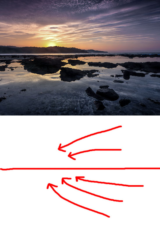
Garis-garis awan dan susunan batu mengarahkan mata ke matahari terbit

Yuk, belajar fotografi, editing dan ikut tur fotografi dengan infofotografi.com


sumber

Tips & Trik Photoshop: Retouch Wajah Berminyak

Ilustrasi (Bisa Komputer)
Jakarta - Wajah berminyak bisa menjadi mimpi buruk bagi sebagian orang, terutama yang sehari-harinya bertemu dengan banyak relasi atau berhadapan dengan kamera. Karena wajah berminyak sama artinya harus melakukan touch up berulang kali; menambahkan bedak setiap kali minyak di wajah mulai muncul.

Tetapi apa jadinya kalau sudah terlanjur difoto dan wajah sedang sangat berminyak. Dengan berbekal Adobe Photoshop, kini wajah berminyak dalam foto bukan masalah lagi. Ikuti langkah-langkah berikut ini:

Buka file foto yang akan diedit di Adobe Photoshop. Klik kanan pada layer Background dan klik Duplicate Layer. Zoom in foto hingga area wajah yang berminyak terlihat lebih fokus dan detail, namun tidak perlu terlalu dekat. Pastikan supaya area yang diperbesar tetap mencakup keseluruhan wajah, sehingga akan memudahkan ketika melihat hasil editan.


Klik Healing Brush Tool, cara penggunaannya sama persis dengan Clone Stamp Tool. Pilih (kloning) area yang bersih dari noda/minyak (tanda + di dalam lingkaran menandakan kursor siap digunakan untuk mencap; lihat gambar), lalu cap di area wajah yang bernoda/berminyak.

Lebih detailnya tentang penggunaan Clone Stamp Tool bisa dibaca di sini.Sesuaikan besar kuasnya dengan ukuran wajah, gunakan kuas berukuran tidak terlalu besar atau terlalu kecil. Lakukan heal sedikit demi sedikit untuk hasil yang lebih rapi.


Hasil jadinya bisa dilihat pada foto di atas.


Penutup

Teknik ini bisa juga diaplikasikan sebagai alternatif penggunaan Clone Stamp Tool dalam menghilangkan jerawat atau noda hitam di wajah akibat bekas jerawat atau luka. Selamat mencoba!


sumber

Sunday, December 2, 2012

100 Tips from a Professional Photographer

100 Tips from a Professional Photographer

Here's a list of tips, advice, rules and just things to know about photography from Eric Kim, a street photographer who also holds photography workshop classes. I think the gist of it is to keep taking pictures always.

Here's the full list:

1. Just because someone has an expensive camera doesn't mean that they're a good photographer.
2. Always shoot in RAW. Always.
3. Prime lenses help you learn to be a better photographer.
4. Photo editing is an art in itself
5. The rule of thirds works 99% of the time.
6. Macro photography isn't for everybody.
7. UV filters work just as well as lens caps.
8. Go outside & shoot photos rather than spending hours a day on photography forums.
9. Capture the beauty in the mundane and you have a winning photograph.
10. Film isn't better than digital.
11. Digital isn't better than film.
12. There is no "magic" camera or lens.
13. Better lenses don't give you better photos.
14. Spend less time looking at other people's work and more time shooting your own.
15. Don't take your DSLR to parties.
16. Girls dig photographers.
17. Making your photos b/w doesn't automatically make them "artsy"
18. People will always discredit your work if you tell them you "photoshop" your images. Rather, tell them that you process them in the "digital darkroom".
19. You don't need to take a photo of everything.
20. Have at least 2 backups of all your images. Like they say in war, two is one, one is none.
21. Ditch the neck strap and get a handstrap.
22. Get closer when taking your photos, they often turn out better.
23. Be a part of a scene while taking a photo; not a voyeur.
24. Taking a photo crouched often make your photos look more interesting.
25. Worry less about technical aspects and focus more on compositional aspects of photography.
26. Tape up any logos on your camera with black gaffers tape- it brings a lot less attention to you.
27. Always underexpose by 2/3rds of a stop when shooting in broad daylight.
28. The more photos you take, the better you get.
29. Don't be afraid to take several photos of the same scene at different exposures, angles, or apertures.
30. Only show your best photos.
31. A point-and-shoot is still a camera.
32. Join an online photography forum.
33. Critique the works of others.
34. Think before you shoot.
35. A good photo shouldn't require explanation (although background information often adds to an image). *
36. Alcohol and photography do not mix well.
37. Draw inspiration from other photographers but never worship them.
38. Grain is beautiful.
39. Ditch the photo backpack and get a messenger bag. It makes getting your lenses and camera a whole lot easier.
40. Simplicity is key.
41. The definition of photography is: "painting with light." Use light in your favor.
42. Find your style of photography and stick with it.
43. Having a second monitor is the best thing ever for photo processing.
44. Silver EFEX pro is the best b/w converter.
45. Carry your camera with you everywhere. Everywhere.
46. Never let photography get in the way of enjoying life.
47. Don't pamper your camera. Use and abuse it.
48. Take straight photos.
49. Shoot with confidence.
50. Photography and juxtaposition are best friends.
51. Print out your photos big. They will make you happy.
52. Give your photos to friends.
53. Give them to strangers.
54. Don't forget to frame them.
55. Costco prints are cheap and look great.
56. Go out and take photos with (a) friend(s).
57. Join a photo club or start one for yourself.
58. Photos make great presents.
59. Taking photos of strangers is thrilling.
60. Candid>Posed.
61. Natural light is the best light.
62. 35mm (on full frame) is the best "walk-around" focal length.
63. Don't be afraid to bump up your ISO when necessary.
64. You don't need to always bring a tripod with you everywhere you go (hell, I don't even own one).
65. It is always better to underexpose than overexpose.
66. Shooting photos of homeless people in an attempt to be "artsy" is exploitation.
67. You will find the best photo opportunities in the least likely situations.
68. Photos are always more interesting with the human element included.
69. You can't "photoshop" bad images into good ones.
70. Nowadays everybody is a photographer.
71. You don't need to fly to Paris to get good photos; the best photo opportunities are in your backyard.
72. People with DSLRS who shoot portraits with their grip pointed downwards look like morons.
73. Cameras as tools, not toys.
74. In terms of composition, photography and painting aren't much different.
75. Photography isn't a hobby- it's a lifestyle.
76. Make photos, not excuses.
77. Be original in your photography. Don't try to copy the style of others.
78. The best photographs tell stories that begs the viewer for more.
79. Any cameras but black ones draw too much attention.
80. The more gear you carry around with you the less you will enjoy photography.
81. Good self-portraits are harder to take than they seem.
82. Laughter always draws out peoples' true character in a photograph.
83. Don't look suspicious when taking photos- blend in with the environment.
84. Landscape photography can become dull after a while.
85. Have fun while taking photos.
86. Never delete any of your photos.
87. Be respectful when taking photos of people or places.
88. When taking candid photos of people in the street, it is easier to use a wide-angle than a telephoto lens.
89. Travel and photography are the perfect pair.
90. Learn how to read a histogram.
91. A noisy photo is better than a blurry one.
92. Don't be afraid to take photos in the rain.
93. Learn how to enjoy the moment, rather than relentlessly trying to capture the perfect picture of it.
94. Never take photos on an empty stomach.
95. You will discover a lot about yourself through your photography.
96. Never hoard your photographic insight- share it with the world.
97. Never stop taking photos
98. Photography is more than simply taking photos, it is a philosophy of life
99. Capture the decisive moment
100. Write your own list.


sumber

Friday, September 21, 2012

Menyeleksi Rambut Acak

Bagi Anda yang baru belajar Photoshop mungkin saja mengalami kendala betapa sulitnya menyeleksi rambut yang tampak tidak teratur namun dengan hasil akhir yang sempurna. Kasus seperti itu biasanya dapat dipecahkan salah satunya dengan fasilitas Channel. Untuk lebih jelasnya silahkan baca Tutorial berikut. Dibawah ini adalah foto yang akan saya jadikan bahan. Silahkan download dulu fotonya.
Tutorial Photoshop Effect, Belajar, Edit, Efek, Foto, photo, Manipulasi, Tool, Teks, Pemula, Menengah, Filter, Download Brush Action Plugin
Pastinya langkah pertama buka dulu foto tersebut dalam Photoshop (Ctrl + O), kemudian klik ganda pada Layer Background untuk mengubah Layer Background menjadi layer biasa.
Tutorial Photoshop Effect, Belajar, Edit, Efek, Foto, photo, Manipulasi, Tool, Teks, Pemula, Menengah, Filter, Download Brush Action Plugin
Beralih pada Tab Channel, kemudian saya mengaktifkan Layer Channel Blue karena pada foto ini Layer Channel Blue adalah Layer yang memiliki perbedaan cahaya gelap terang yang paling jelas dibanding Layer Channel lainnya. Klik kanan dan pilih Duplikat Channel.
Tutorial Photoshop Effect, Belajar, Edit, Efek, Foto, photo, Manipulasi, Tool, Teks, Pemula, Menengah, Filter, Download Brush Action Plugin
Hasil Duplikat Channel akan menciptakan Layer Channel Blue Copy. Sekarang pastikan hanya Layer Channel Blue Copy dalam keadaan aktif.
Tutorial Photoshop Effect, Belajar, Edit, Efek, Foto, photo, Manipulasi, Tool, Teks, Pemula, Menengah, Filter, Download Brush Action Plugin
Pilih Dodge Tool (O) pada Toolbox, dan sapukan Dodge Tool (O) ke bagian background foto. Dan pilih juga Burn Tool (O), sapukan kuas Burn Tool (O) ke bagian objek foto hingga akhirnya menghasilkan 2 warna hitam dan putih.
Tutorial Photoshop Effect, Belajar, Edit, Efek, Foto, photo, Manipulasi, Tool, Teks, Pemula, Menengah, Filter, Download Brush Action Plugin
Lihat hasilnya yang mirip gambar siluet.
Tutorial Photoshop Effect, Belajar, Edit, Efek, Foto, photo, Manipulasi, Tool, Teks, Pemula, Menengah, Filter, Download Brush Action Plugin
Klik icon Load Channel as Selection.
Tutorial Photoshop Effect, Belajar, Edit, Efek, Foto, photo, Manipulasi, Tool, Teks, Pemula, Menengah, Filter, Download Brush Action Plugin
Sehingga background foto akan terseleksi.
Tutorial Photoshop Effect, Belajar, Edit, Efek, Foto, photo, Manipulasi, Tool, Teks, Pemula, Menengah, Filter, Download Brush Action Plugin
Kembali ke Tab Layers. Tekan tombol delete pada keyboard untuk menghapus area yang terseleksi.
Tutorial Photoshop Effect, Belajar, Edit, Efek, Foto, photo, Manipulasi, Tool, Teks, Pemula, Menengah, Filter, Download Brush Action Plugin
Perfect! hasil seleksi benar-benar tampak sempurna. Tekan Ctrl + D untuk men-disselect seleksinya. Okey, sekarang Anda siap mengganti backgroundnya dengan gambar background yang Anda inginkan. Misalnya seperti ini...

Tutorial Photoshop Effect, Belajar, Edit, Efek, Foto, photo, Manipulasi, Tool, Teks, Pemula, Menengah, Filter, Download Brush Action Plugin


sumber

Wednesday, September 12, 2012

Antarmuka (User Interace) pada Adobe Photoshop CS3

Pada tulisan sebelumnya, telah dibahas tentang aplikasi pengolah grafis CorelDRAW X3 yang berbasis vektor. Berbeda dengan CorelDRAW X3, Adobe Photoshop adalah salah satu software untuk mengolah foto atau gambar berbasis bitmap yang populer saat ini. Dengan Photoshop, Anda dapat memperbaiki dan memperindah foto yang ingin dicetak dengan menambah beberapa efek pada foto tersebut. Dengan demikian, tampilan foto menjadi berbeda dan menarik.
Walaupun terdapat berbagai macam program yang dapat digunakan untuk mewarnai ilustrasi Anda, Photoshop dengan segala kelebihan dan kekurangannya dapat dimaksimalkan untuk menghasilkan ilustrasi berwarna yang indah. Anda dapat menghasilkan ilustrasi dengan teknik berbeda dengan teman Anda walaupun tool yang digunakan sama. Anda juga dapat mengerjakan ilustrasi berwarna secara manual untuk kemudian diedit lebih lanjut dengan Photoshop.
Layar Pembuka (Opening Screen) Adobe Photoshop Cs3
Berikut ini beberapa perubahan baru yang terdapat dalam Adobe Photoshop CS3 yang berbeda dengan versi sebelumnya.
  1. Tampilan baru pada jendela dan lembar kerja yang menawan, mempermudah Anda untuk mengatur tampilan kerja agar lebih nyaman.
  2. Tampilan panel Tool yang fleksibel dapat ditampilkan menjadi satu kolom atau dua kolom.
  3. Tombol Quick Mask tampil sebagai tombol single menyerupai tombol On/Off untuk mengaktifkan dan menonaktifkan fungsi Quick Mask.
  4. Panel ditampilkan dalam sebuah dock yang secara fleksibel dapat diubah sesuai dengan ukuran yang diinginkan sehingga Anda akan lebih leluasa memaksimalkan tampilan lembar kerja.
  5. Mode Full Screen baru yang diberi nama Maximize Screen Mode, berfungsi memaksimalkan ukuran jendela gambar semaksimal mungkin menyesuaikan dengan layer.
Tampilan Lembar Kerja Adobe Photoshop CS3
Untuk memulai Adobe Photoshop CS3, klik tombol Start → All Programs  Adobe Photoshop CS3. Pada layar akan ditampilkan ruang kerja Adobe Photoshop CS3.

a. Ruang Kerja / Workspace
Merupakan area kerja atau tampilan kerja dari file atau gambar yang sedang dikerjakan.
Area Kerja / Workspace Adobe Photshop CS3

b. Titlebar
Merupakan batang judul jendela yang berfungsi untuk menampilkan judul atau nama program yang sedang aktif.
c. Menubar
Merupakan baris menu yang berisi perintah dan fasilitas default yang disediakan oleh sebuah program. Ada 9 menu utama yang terdapat pada Adobe Photoshop, yaitu File, Edit, Image, Layer, Select, Filter, View, Window, dan Help.
d. Optionbar
Merupakan bagian yang berisi sekumpulan tombol atau pilihan yang berhubungan dengan suatu Tool tertentu. Tombol pilihan yang ditampilkan di dalam Optionbar akan menyesuaikan dengan tombol atau peranti yang terpilih di dalam panel Tools.
Panel Tools
e. Dock Panel
Dalam Photoshop, Dock Panel digunakan untuk mengontrol sifat dan cara kerja dari tombol-tombol yang ada pada panel Tools. Selain itu, untuk serta mendukung proses kerja yang terjadi pada gambar atau foto yang sedang dikerjakan. Pilihan pada menu Window menunjukkan jenisjenis panel yang ada. Jika Anda memilih salah satu panel melalui menu Window tersebut, maka panel yang Anda pilih akan ditampilkan sebagai tampilan jendela yang melayang (Floating Window) dalam ruang kerja.
Dock Panel terdiri atas beberapa bagian berikut.
  • Panel Navigator untuk mengatur besar tampilan gambar.
  • Panel Color untuk mengatur pemberian warna.
  • Panel Layer untuk mengatur layer yang ada di ruang kerja.
f. Panel Tool
Panel tool merupakan sebuah bagian yang berisi berbagai peranti yang dapat digunakan untuk memanipulasi dan menyunting sebuah gambar atau foto. Berikut adalah beberapa panel yang sering digunakan dalam pengeditan gambar.
Ikon Panel Tool
Penjelasan fungsi beberapa ikon pada Dock Panel
  • Retangular Marquee. Untuk membuat seleksi yang berbentuk segi empat.
  • Lasso. Untuk membuat seleksi dengan menggambar pola bebas (freehand). Pada saat mouse dilepas, titik awal dan titik aahir akan terhubung. Anda dapat mengaktifkan kotak periksa Anti Aliased pada Optionsbar untuk menghaluskan seleksi. Untuk menjalankan fasilitas Lasso Tool, gunakan proses drag and drop.
  • Crop. Untuk mengambil area pada citra atau tampilan yang diinginkan. Perhatikan bahwa peranti ini mempengaruhi semua layer yang ada, baik yang aktif maupun tidak. Lasso
  • Eraser. Digunakan untuk menghapus area pada layer. Anda dapat memilih salah satu dari jenis penghapus Pencil, Block, Airbrush, atau Paintbrush melalui Optionsbar.
  • Move. Untuk memindahkan objek, gambar
  • Magic Wand. Untuk membuat seleksi atas pixel –pixel yang ada di dalam kawasan warna tertentu. Toleransi dapat ditetapkan melalui Optionsbar.
  • Brush. Kuas untuk menyapukan warna pada layar kerja
  • Type. Untuk mengetikkan teks
  • Line. Line digunakan untuk membuat garis. Peranti ini juga dapat digunakan untuk membuat garis dengan mata panah pada ujungnya. Gunakan Anti-Aliased pada Options Panel untuk membuat garis yang halus.
  • Eyedropper. untuk memilih warna sample dari gambar
Panel Pada Adobe Photoshop CS3
Panel merupakan jendela-jendela yang melayang di ruang kerja. Panel dapat dimunculkan dari menu Window.
a. Panel Layer
Panel Layer menunjukkan semua layer yang ada di dalam lembar kerja Anda. Untuk urutannya, layer baru akan ditempatkan di atas layer yang sudah ada. Dengan Panel Layer, Anda dapat mengubah urutan layer, menghapus layer, membuat layer baru, membuat duplikasi dari layer yang sudah ada, dan menampilkan atau menyembunyikan layer.
Panel Layer
b. Panel History
Panel History merupakan fasilitas untuk menyimpan status perubahan yang telah Anda lakukan terhadap sebuah tampilan lembar kerja. Dengan fasilitas Panel History, Anda dapat melakukan pembatalan perintah terhadap perintah yang telah Anda jalankan (undo).
Panel History
c. Panel Navigator
Panel Navigator berisi thumbnail dari file gambar atau salah satu bagian dari gambar yang sedang Anda kerjakan. Dengan menggunakan fasilitas Panel Navigator ini, Anda dapat mengubah besar kecilnya tampilan lembar kerja dengan menggunakan fasilitas Zoom Slinder yang terdapat di bagian bawah jendela Panel Navigator.
Panel Navigator

d. Panel Swatches
Panel Swatches merupakan sebuah tabel warna untuk mengolah warna dari gambar yang Anda buka.
Panel Swatches

e. Panel Color
Anda dapat mengatur warna foreground maupun background dengan menggunakan fasilitas Panel Color, berdasarkan kombinasi warna yang telah Anda tentukan sendiri. Aktifkan pilihan set Foreground Color untuk menentukan warna foreground, dan aktifkan pilihan Set Background Color untuk menentukan warna background.
Panel Color

f. Panel Styles
Panel Styles menyediakan beberapa tampilan style yang secara default disediakan oleh Adobe Photoshop. Style ini dapat digunakan pada objek, seperti teks, shape, dan layer yang ada di dalam lembar kerja. Anda juga dapat mengubah pilihan style ke beberapa bentuk style yang ada dengan cara mengklik tombol menu yang terdapat di kanan atas jendela Panel Style hingga muncul tampilan beberapa menu pilihan style.
Panel Styles

g. Workspace
Peranti ini merupakan tampilan baru Adobe Photoshop CS3 yang berfungsi mengatur tampilan jendela kerja. Anda dapat mengatur tampilan panel sesuai dengan kebutuhan kerja Anda dengan tombol Workspace. Photoshop hanya akan menampilkan panel-panel yang diperlukan, sesuai dengan kategori tampilan kerja yang Anda pilih. Anda juga dapat mengatur tampilan lembar kerja ke posisi default dengan menggunakan pilihan Default Workspace. Tombol Workspace terletak di dalam Optionbar.


sumber

Monday, September 3, 2012

Adobe Siapkan Photoshop Khusus Retina Display

adobe.com
KOMPAS.com - Layar retina display dengan kepadatan pixel tinggi (High Dots Per Inch atau HiDPI) milik salah satu MacBook Pro besutan Apple mampu menampilkan gambar yang sangat tajam. Tetapi kemampuan tersebut menjadi percuma ketika tidak disertai dengan optimalisasi aplikasi-aplikasi pihak ketiga.

Karena itulah Adobe, pembuat software editing foto populer Photoshop, menyiapkan versi khusus aplikasi tersebut yang dioptimalisasi untuk layar HiDPI.

Adobe mengumumkan bahwa dukungan layar HiDPI akan mulai tersedia pada Photoshop CS6 dalam beberapa bulan ke depan, disusul oleh Lightroom 4.

Layar pada MacBook Pro with Retina Display memiliki resolusi 2880x1800. Hal ini menjadi masalah ketika aplikasi-aplikasi yang tidak dioptimalisasi untuk resolusi tinggi tersebut berjalan seolah-oleh dengan resolusi 1440x900 yang merupakan resolusi standar MacBook pro tanpa retina display.

Setiap pixel pada tampilan aplikasi -termasuk gambar atau foto pada Photoshop- diekspansi hingga menjadi sebesar empat pixel (pixel doubling). Akibatnya, gambar yang ditampilkan tampak pixellated atau kotak-kotak seperti memiliki resolusi rendah, walaupun sebenarnya tidak demikian.

 Contoh dari hal ini bisa dilihat dari gambar yang dihasilkan oleh aplikasi yang dioptimalkan untuk retina display (aplikasi Preview bawaan Mac OS) dan yang tidak dioptimalkan (Photoshop), seperti disampaikan oleh fotografer yang dikutip PetaPixel.

compare_mini
Perbedaan tampilan aplikasi Preview (atas) dan Photoshop pada layar retina display (Gambar: Brian Hawkins/ PetaPixel.com).

Perbedaan di atas menyulitkan sejumlah teknik editing foto yang berkaitan dengan detail halus gambar seperti sharpening karena hasil akhirnya tidak bisa dilihat dengan benar.

Adobe menjanjikan update retina display Photoshop CS6 akan dirilis menjelang akhir tahun ini. Aplikasi-aplikasi Adobe lainnya yang juga akan dioptimalisasi untuk layar ber-resolusi tinggi termasuk Dreamweaver, Edge Animate, Illustrator, Lightroom, Photoshop, Photoshop Touch, Prelude, Premiere Pro, dan SpeedGrade. Adapun versi murah dari Photoshop, yaitu Photoshop Elements, tidak termasuk dalam daftar.


sumber

Sunday, August 12, 2012

Conceptual Artwork Photoshop Tutorial

I mentioned in my last tutorials that I will make more concept and surreal artworks because I like that style. I like to make an artwork that transmits an idea or reflects a feeling or state of mind and for this artwork I chose to play with the idea of time once again.
I’d like to show you how to work with perspectives so I’ll make an introduction to the Vanishing Point and especially how to compose stock images so that they look naturally lit, in other words how to combine stock images without them looking weird as far as lighting is concerned.

Final Result


Stock used

Video version


Step 1

As usually I started with the background and, once again, I was limited to using the rather small dimensions of the background image as my canvas size. So open the background image and proceed to the next step.

Step 2

Open the stock image of the man and extract if from the background using the Pen Tool, Quick Selection tool or whater technique you like. Notice how I left a part of the original background on the bottom part of the man’s feet. We will mask that on the next step.

Lighting tip

Choosing your image wisely can save you precious time. In this case the man blends almost perfectly with the background image without making any adjustments. Also notice how the illuminated part of the man is facing towards the right side of the background. This makes a lot of sense because you can see that the light comes from the right side. Keep that in mind when you compose your image using different stock images.

Step 3

Create a layer mask for the man layer. Now select the default grass brush to mask the man’s feet and make him blend with the grass from the background image. You have to open the brush window (Window>Brush) and deactivate Color Dynamics. Make sure you paint with black on the layer mask.

Step 4

Create a duplicate of the man layer and use Hue/Saturation to reduce the Lightness to 0 and obtain a silhouette. Then use the Distort Tool to cast the shadow of the man on the ground. Apply some Gaussian Blur to soften it a bit. You can use the same step to mask part of the shadow on the man’s right foot. I reduced the Opacity of the shadow layer to 60%.

Step 5

The only adjustment you need to make to the man in order to blend him perfectly with the background, is a color adjustment which I made using a Photo Filter as a clipping mask layer and Normal blend mode.

Step 6

Add the clock image on the canvas on a new layer as shown on image 6. I used a Photo Filter (Orange Color and Density to 50%) and Color Balance as clipping masks to add more yellow to it. That way it blends a lot better with the background.

Step 7

In order to keep the light effects consistent throughout the scene, I added some light on the right side of the clock using Inner Shadow.

Step 8

Now you have to duplicate and scatter those clocks keeping the perspective. The best way of doing that is using the Vanishing Point Tool. We are going to render a perspective grid that will help use line up the clocks into the distance.
Create a new empty layer above the clock layer and go to Filter>Vanishing Point. Draw a plane as shown on image 8.
Use the lines on the horizon of the background image as guide. If the plane turns out yellow, the plane is not correct, it has to be blue. Once you have the plane, click the drop down menu on the top left side of the settings bar and select Render Grids to Photoshop and click OK.

Step 9

Now you should have a new grid rendered on the new layer, you will use that as a guide to help you line up the clocks. So duplicate the clock layer using Ctrl+J and resize it helping yourself with the gird. See image 9.

Step 10

In order to add some variations I used other stock images of clocks to change the dials on each clock so that they indicate different hours.

Step 11

Now you have to do some masking. Select all the clocks and dials if you changed them like I did on Step 11 and group them pressing Ctrl+G. A new folder containing all the layers with the clocks should be created. I named this group Clocks and I created a layer mask for it. Next I used the same grass brush to paint on this layer mask and create the effect that the clocks are emerging from the grass on the ground.

Step 12

Now that the clocks are in place, you can make the shadows. Simply duplicate the biggest clock and use the same technique used with the man to cast the shadow. Obviously this shadow should fall behind the man.

Now you can duplicate this shadow and resize it because all clocks are the same. I also applied a few pixels of Gaussian Blur to soften it and reduced the layer Opacity to 70%.
There is one thing you can do to make these shadows a lot more realistic. Make it look like some of the shadows are covered by grass. Again I grouped all the shadow layers and use a layer mask on the group to do exactly the same thing I did with the clocks.

Step 13

Create a new layer on top of all the layers and change it’s blend mode to Screen. Use a soft brush about 650px in diameter and paint to glows of light using the color #866946.

Step 14

From now on you can leave it like this or add whatever you like. I added a few words and painted some letters in different colors to compose a “hidden” message.

Step 15

Next I use the Pen Tool to trace some paths and connect some of the words with the clocks and also link the clocks between them. To create the lines just draw the paths and then right click and choose Stroke Path.

Final adjustments

Whether you followed steps 14 and 15 or not, you can continue here. You can give your artworks a different, more modern look by making some general adjustments to the entire artwork.
I created a Stamp with Shift+Ctrl+Alt+E and then I went to Image>Adjustments>Variations and I chose More Blue and I reduced the layer’s Opacity to 15%.

In order to adjust the general illumination on the scene I used the Lighting Effects Filter. First I created a new stamp with the same keyboard shortcut and then I applied the filter. See the settings below.

I gave the last touch using two adjustment layers to shift the color with Color Balance and increase the contrast a bit using Levels.

This is the result of the general adjustments we made. On the left is the result we got on Step 15 and on the right is the final result after applying the general adjustments.

Final result


sumber